


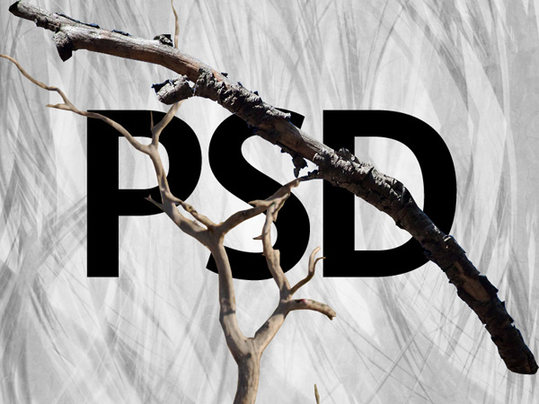
Final Image
As always, this is the final image that we’ll be creating:

Step 1
Create a new document (800X600px).
Drag out a radial gradient ranging from f8f8f8 to e0e0e0 on your background layer:

Step 2
Paste in your bark texture:

Now apply a hue/saturation adjustment layer. Be sure to apply a clipping mask (layer>create clipping mask), so that your adjustment layer only effects your underlying bark layer.

Now return to your bark texture layer. Reduce it’s opacity to 30%, and change it’s blend mode to ‘overlay’.

Step 3
Now download the abstract lights brush set from the resources for this tutorial.
Create a new layer called ‘brush marks 1′.
Apply several of the brush marks (using a black paintbrush). Then change this layer’s blend mode to ‘overlay’ and reduce it’s opacity to 80%.


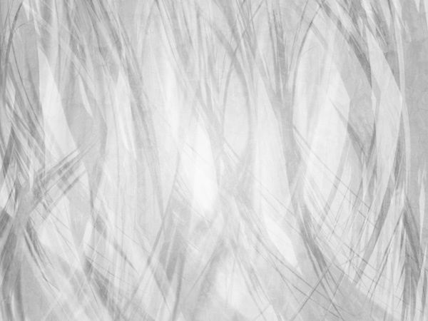
Step 4
Now apply a couple more layers, applying more black brush marks, and then some white ones. The idea is just to layer up your background effect:
Step 5
Now apply some text in the center of your canvas. The text can say whatever you want, but in this case I’ve just typed out the letters ‘PSD’. The font is not important, but it’s easier if you use a legible, bold font:

Step 6
Now cut out and paste in your branches from the branch photos in the resources for this tutorial. Keep these images on separate layers, so that you can easily paste them onto subsequent layers:
Step 7
Paste your tree photo into the bottom left of your canvas, positioning it against the bottom of your P letter.

Now we want to make our tree more stylized to fit with our overall composition. Apply a color overlay blending option to your tree layer, and then apply a hue/saturation adjustment layer (being sure to apply a clipping mask to it).
Color Overlay Blending Option Setting:
Blend Mode: Normal
Color: 000000
Opacity: 65%
Color: 000000
Opacity: 65%
Hue/Saturation Adjustment Layer Settings:
Hue: 0
Saturation: -100
Lightness: 0
Saturation: -100
Lightness: 0

Step 8
Now we want to start morphing our branch images to fit to our letters. To do this we’re going to use the puppet warp tool. Position the branch roughly over your letter, and then go to edit>puppet warp. Warp the branch to fit around part of your letter:

Step 9
This is how your composition looks once you’ve warped several branches to cover all your letters. With each branch layer, be sure to apply the same color overlay blending option and hue/saturation adjustment layer as your original branch layer.

Here is the composition with the original type layer hidden:

Step 10
Now create a new layer called ‘brush marks over letters’. Select your abstract marks brush again, and apply your brushes over your letters, applying a subtle frayed edge effect:

Step 11
A quick tip when applying your brushes is to rotate your brush marks where necessary. Brush sets may not always be at the correct angle to follow the contours of your layers, so you can easily alter the angle of your brushes to fit. Simply open up your brushes panel, and change the angle option (see below):

Step 12
Now create a new layer called ‘highlights’.
Drag out several white to transparent radial gradients over the tops of your letters.
Then change this layer’s blend mode to ‘overlay’ and reduce it’s opacity to 40%.


Step 13
Now paste in your crow photo from the resources for this tutorial.
Position it on top of one of your letters, and then apply a color overlay blending option:
Color Overlay Blending Option Settings:
Blend Mode: Normal
Color: 000000
Opacity: 65%.
Color: 000000
Opacity: 65%.

Step 14
Now apply a final levels adjustment layer in order to add extra contrast to your composition.
Levels Adjustment Layer Settings:
0 / 1.08 / 247

And We’re Done!
You can view the final outcome below. I hope that you enjoyed this tutorial and would love to hear your feedback on the techniques and outcome.


0 comments:
Post a Comment